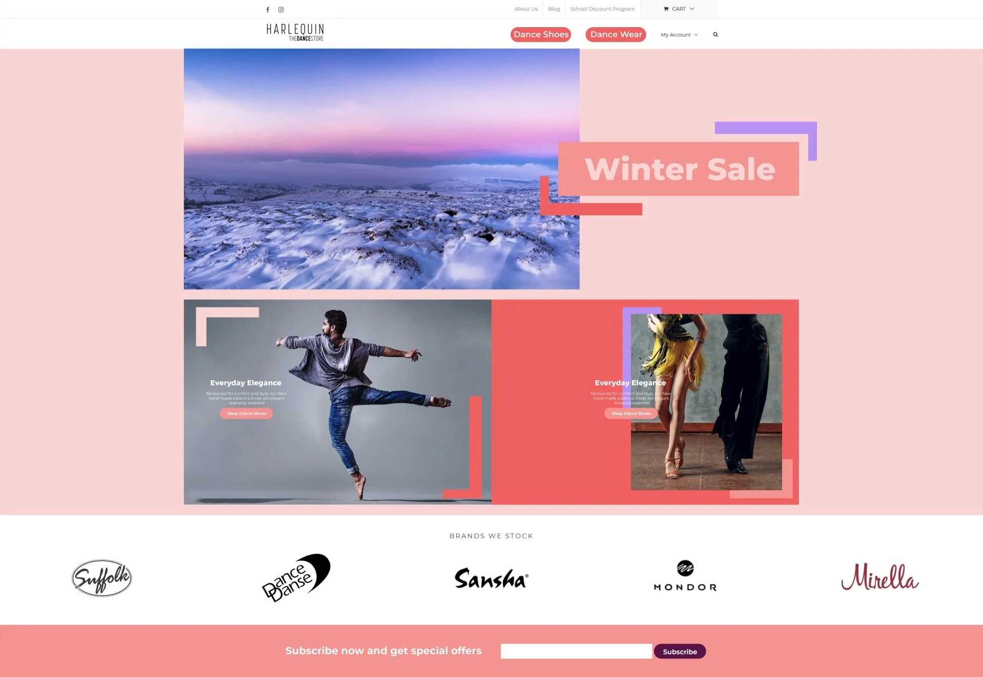
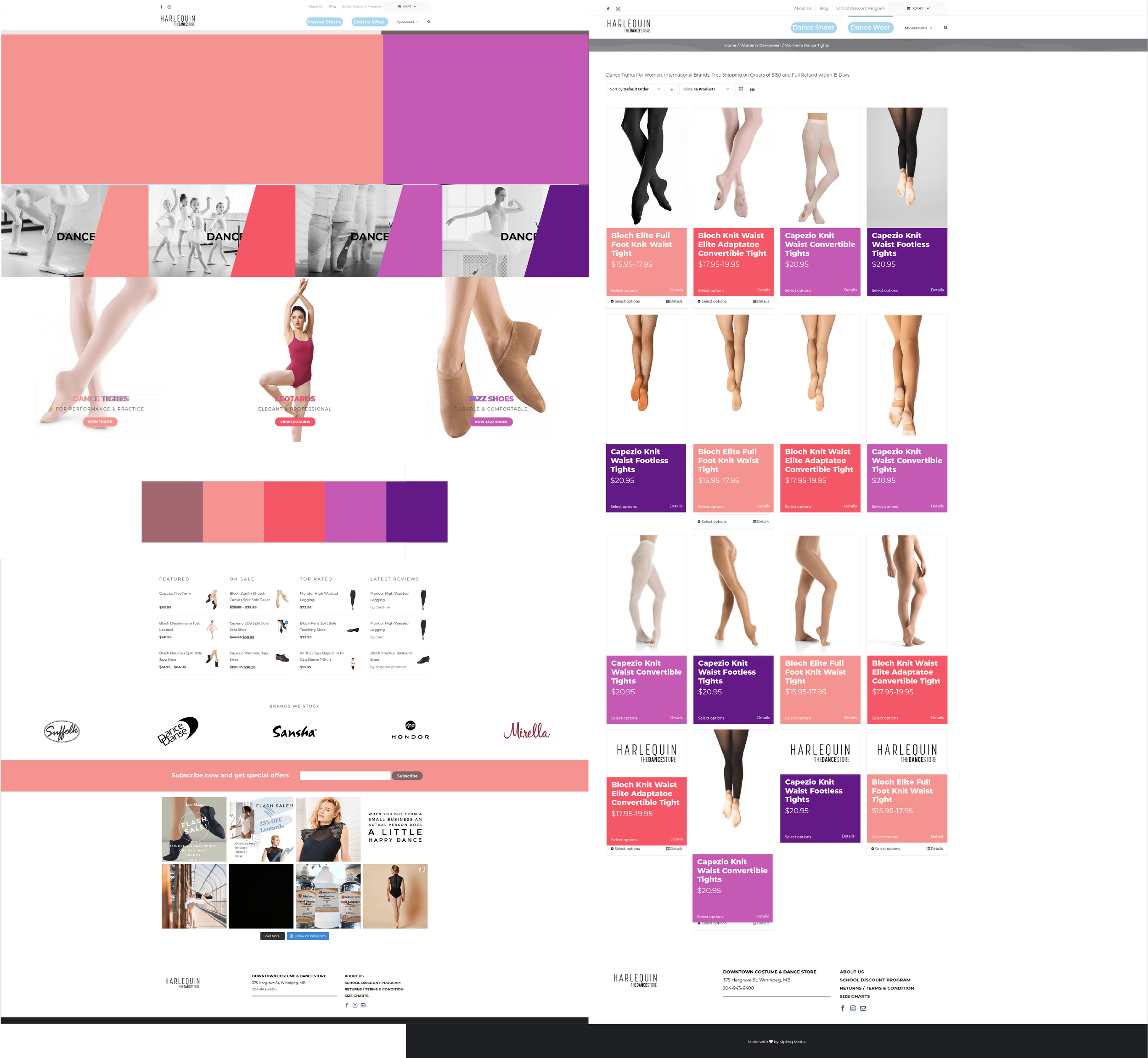
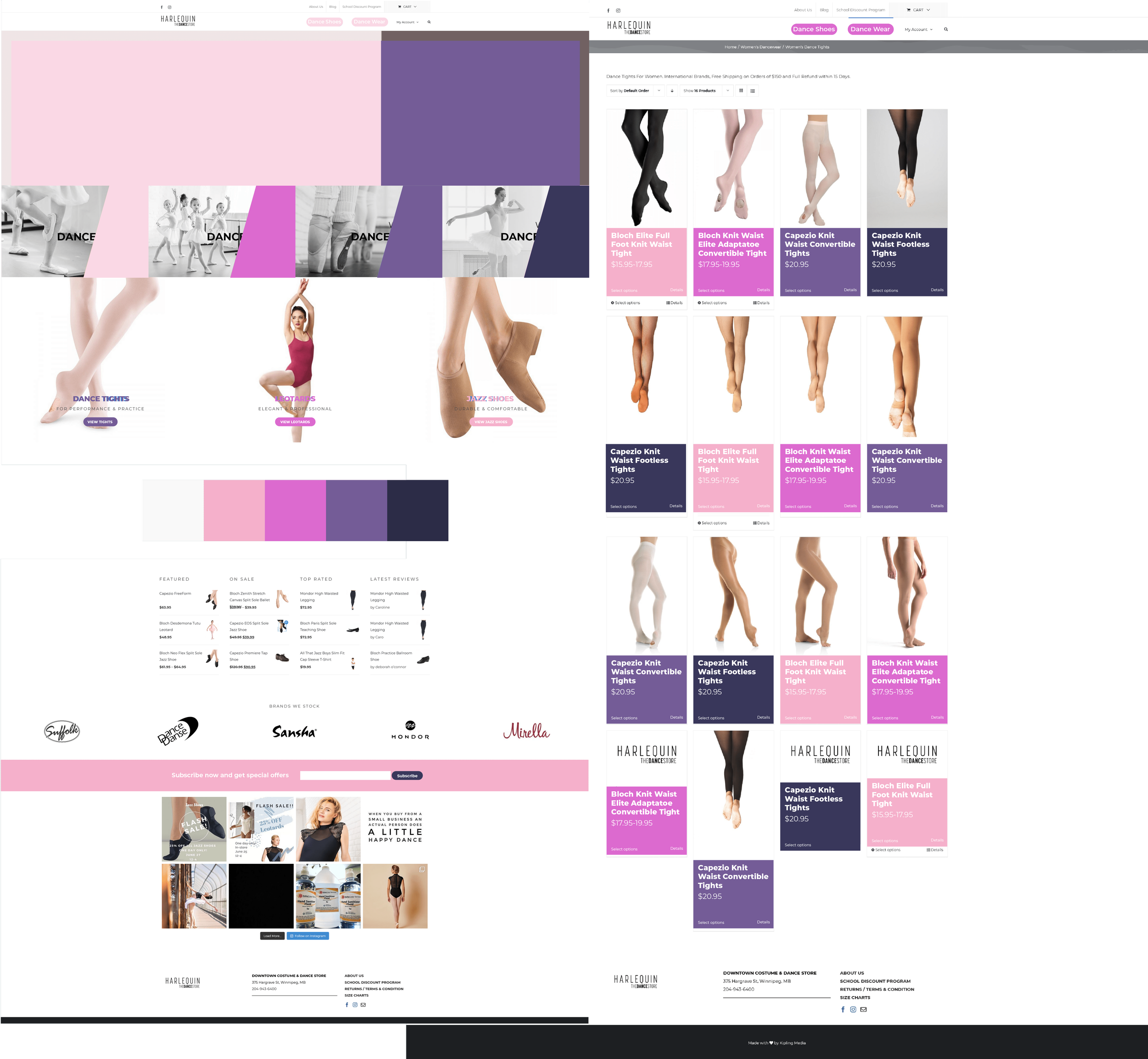
We had a chance to propose a reskin to a clients website. Without changing the fundamental structure of the design we were trying to create a fresh new look. Here are the 3 colour palettes along with some unique elements particularity for the front page that I proposed to refresh the website.
Option 1
Focused on a warm and rosy colour palette. Featuring small angular elements to add interest to the front page. Colours used strongly throughout the product page and other pages.
Option 2
A darker moodier colour palette. Featuring rounded elements on the front page to match the existing style of the buttons. Continuing that rounding in a strong way throughout the front page.
Option 3
A pastel focused colour palette. Using a fun diamond pattern on the home page with contrasting black and white imagery. Heavy use of the bright colours throughout the rest of the website to convey the fun and creativity of dance.


