Make it stand out.
Puffland Branding Proposal

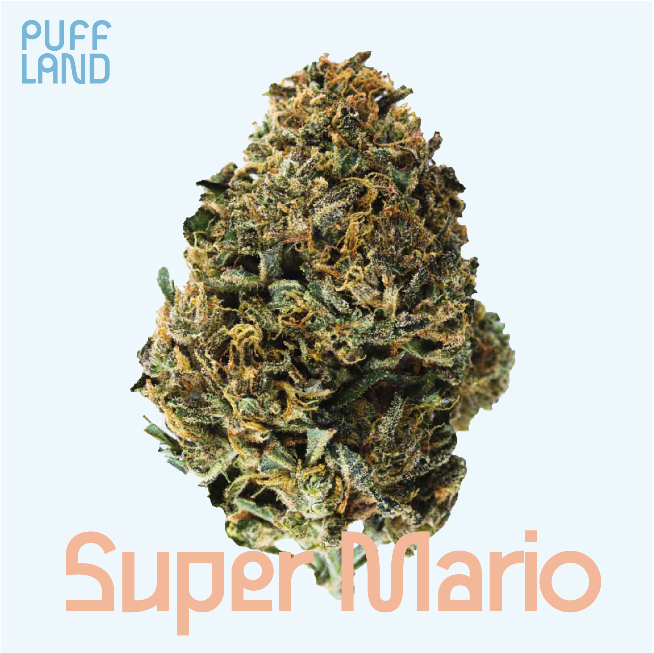
I had the chance to try and come up with some branding proposals for Puffland. I Focused on keeping the branding fun utilizing the font and brightening up the colour palette. Attempting to diversify from the green that’s so commonly associated with weed brands. Below are my options proposed utilizing a familiar social media feed layout as they are an online company.

Option #1
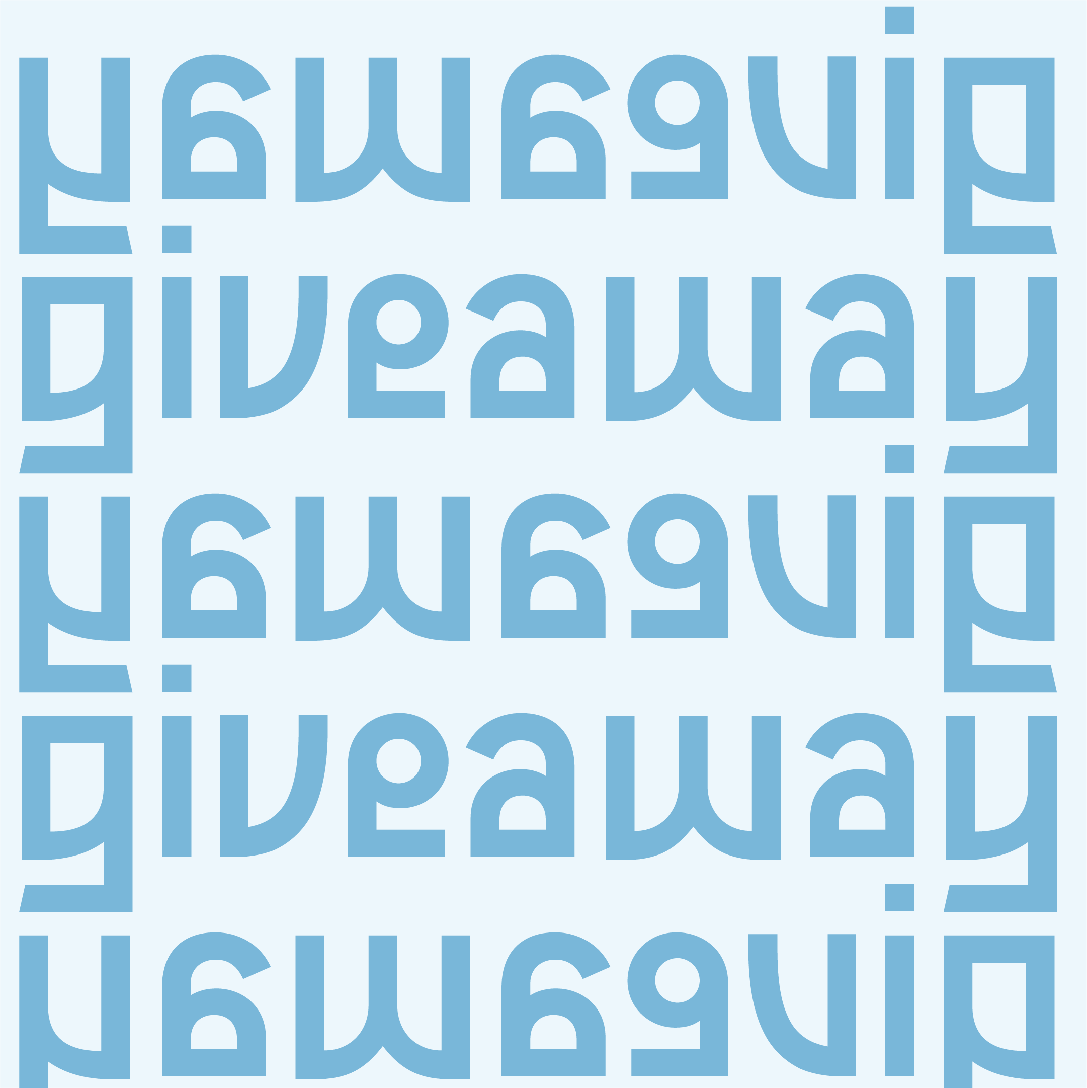
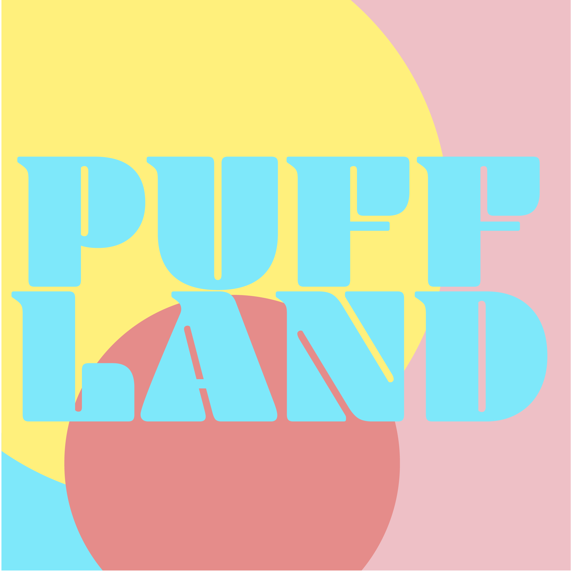
This branding idea was based around this fun font Gulax. The colours and the font bring a sense of fun whilst not sacrificing legibility too much. If this proposal was chosen I would have put more work into making the word mark more unique. Due to time constraints i kept it simple in order to focus on fleshing out social media post ideas and expressing the possibilities of the colour combinations.

Option #2
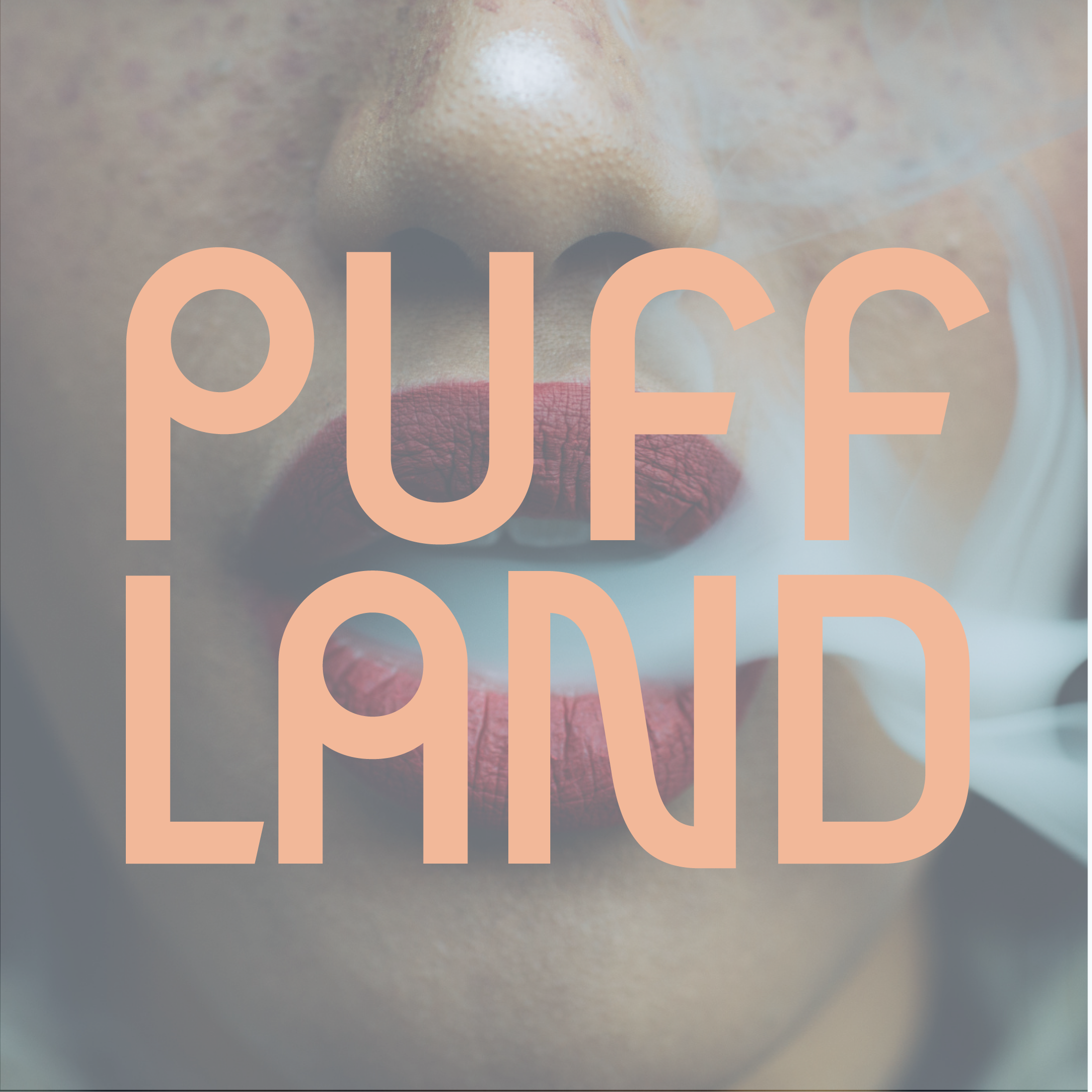
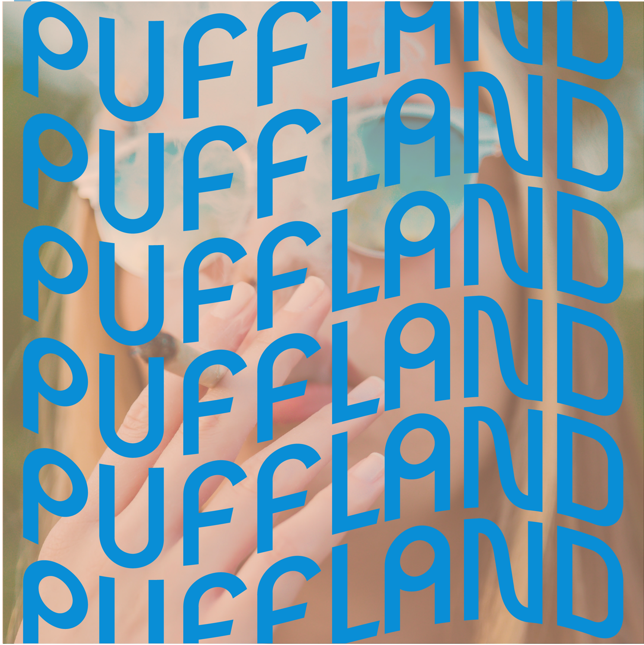
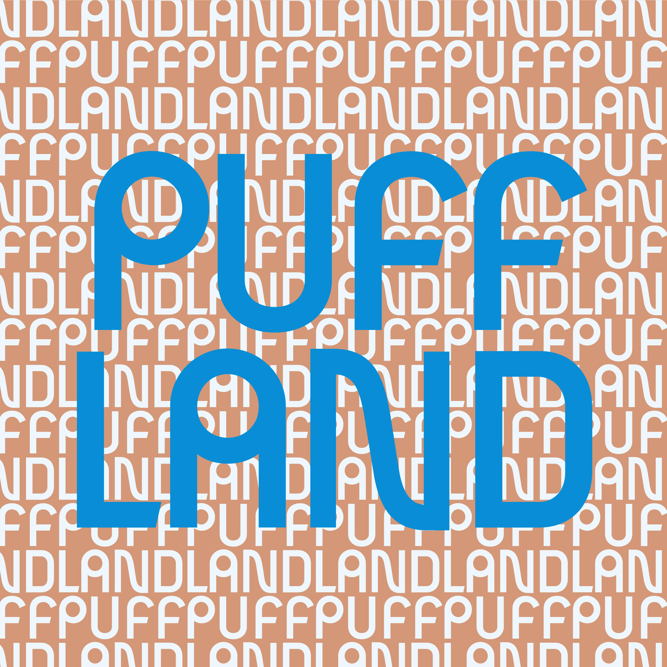
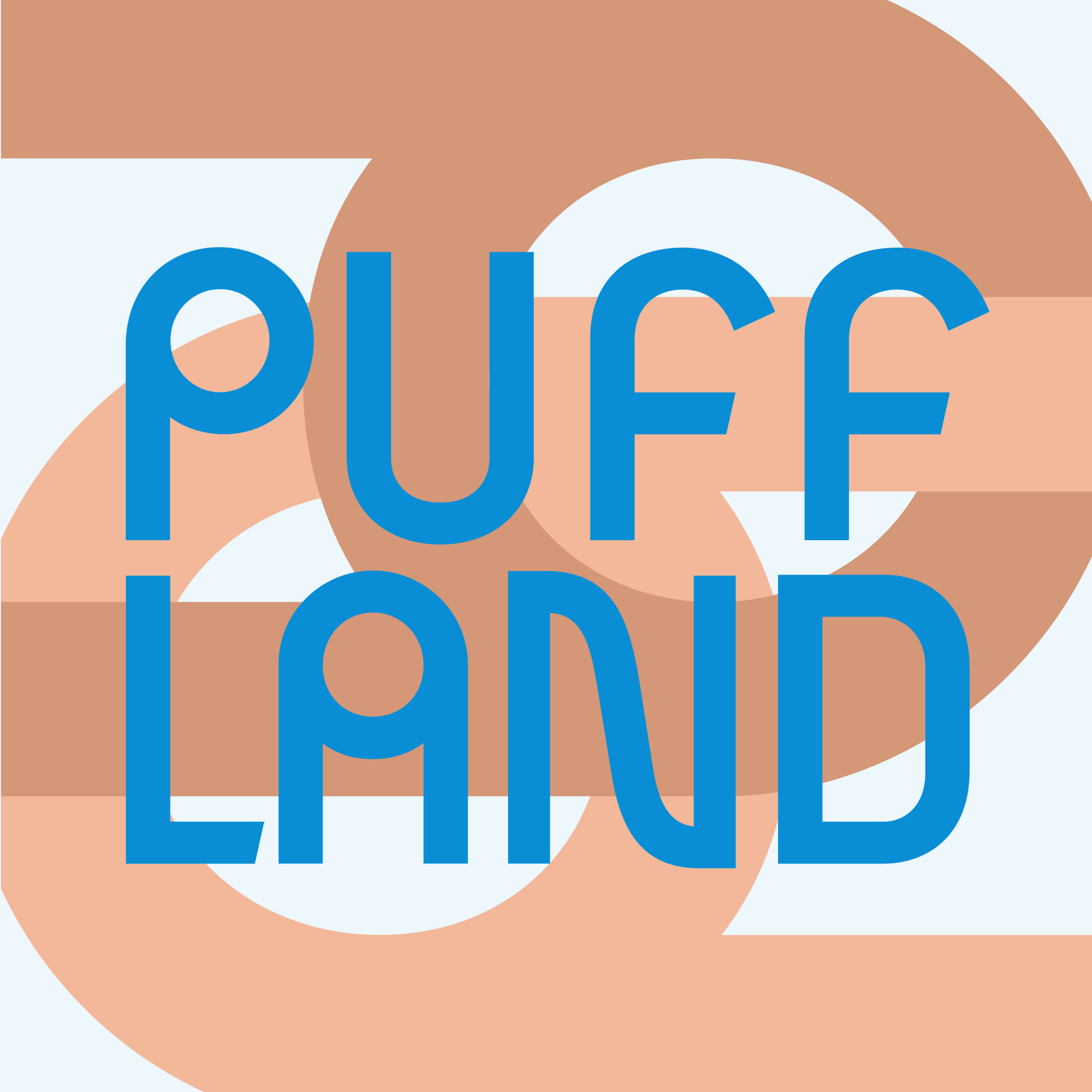
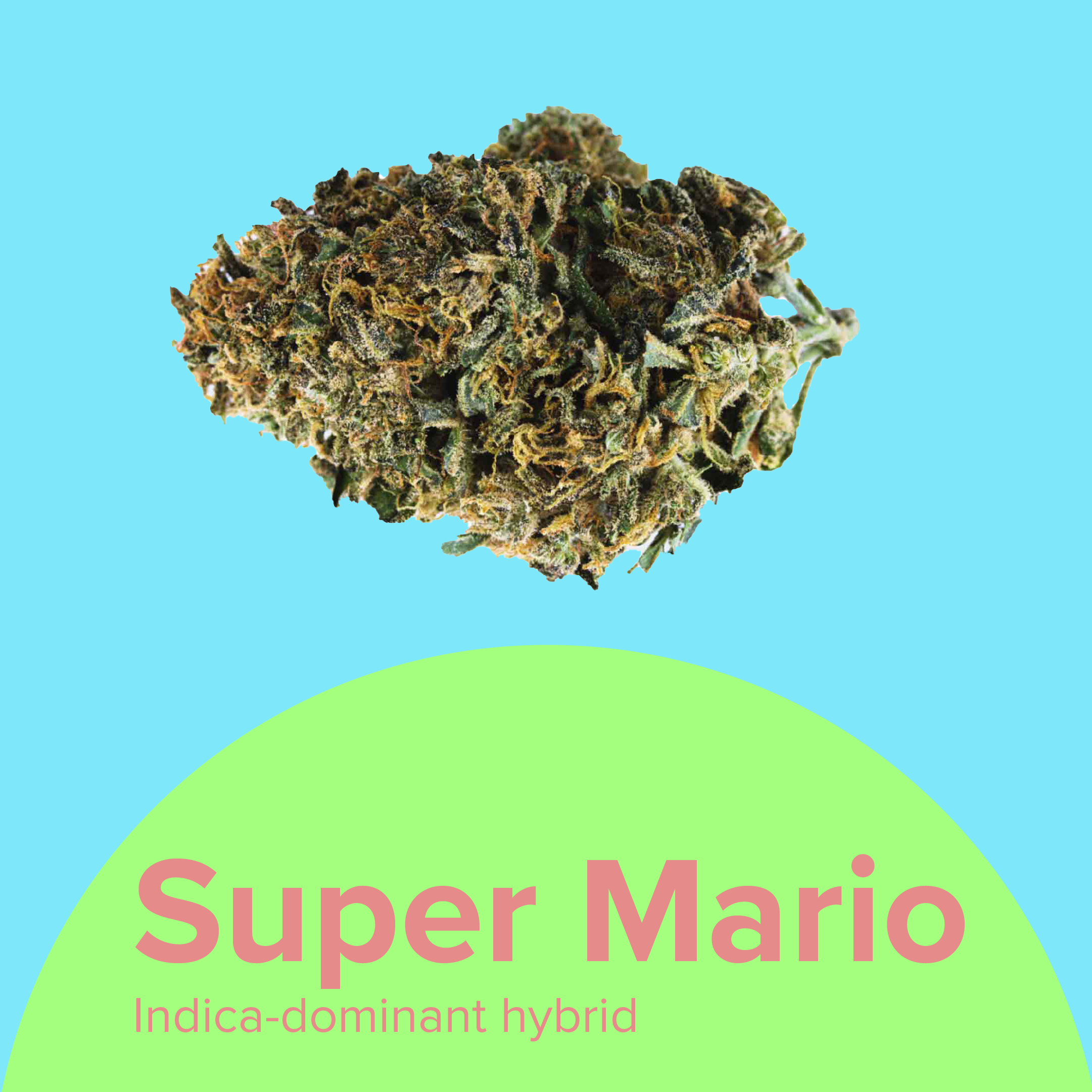
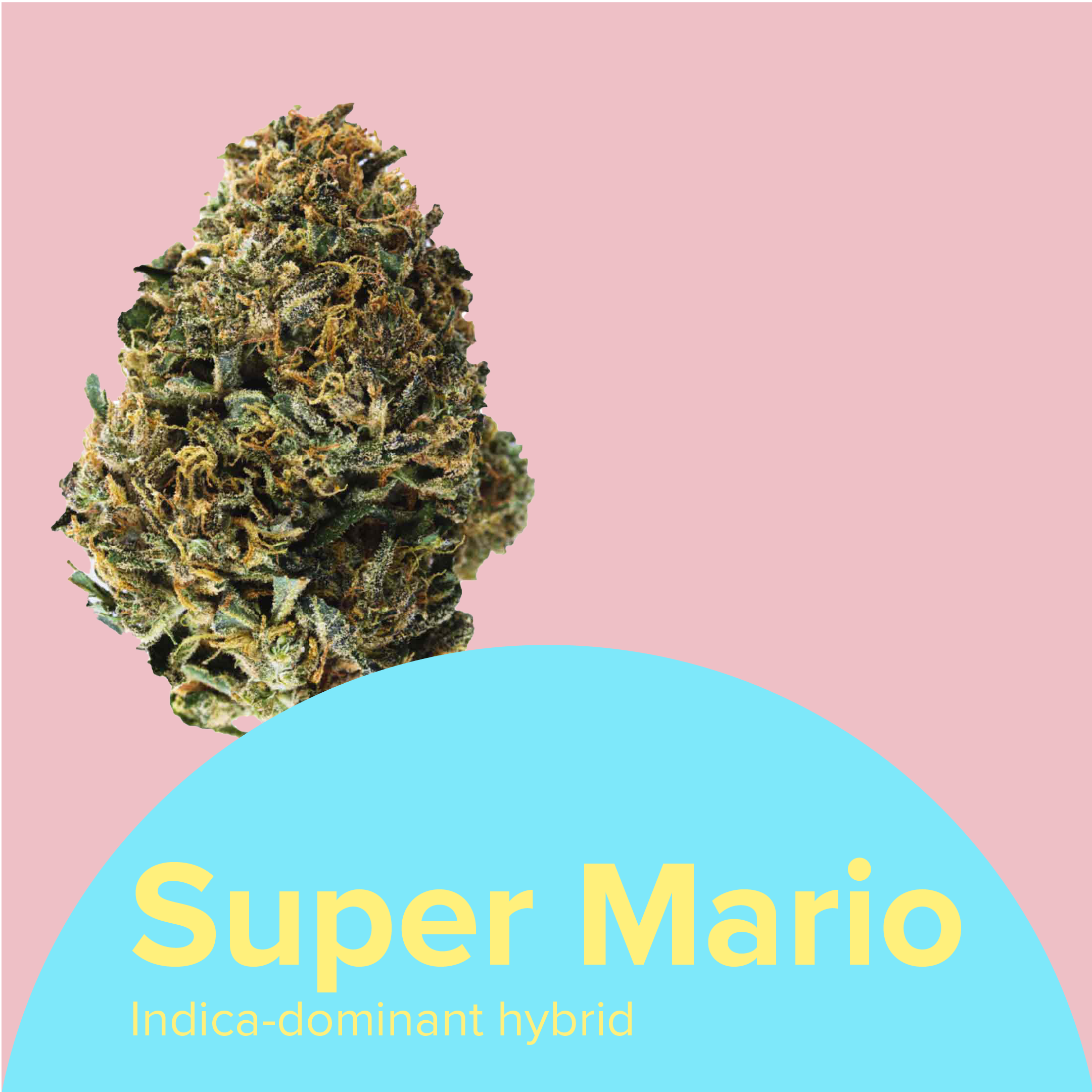
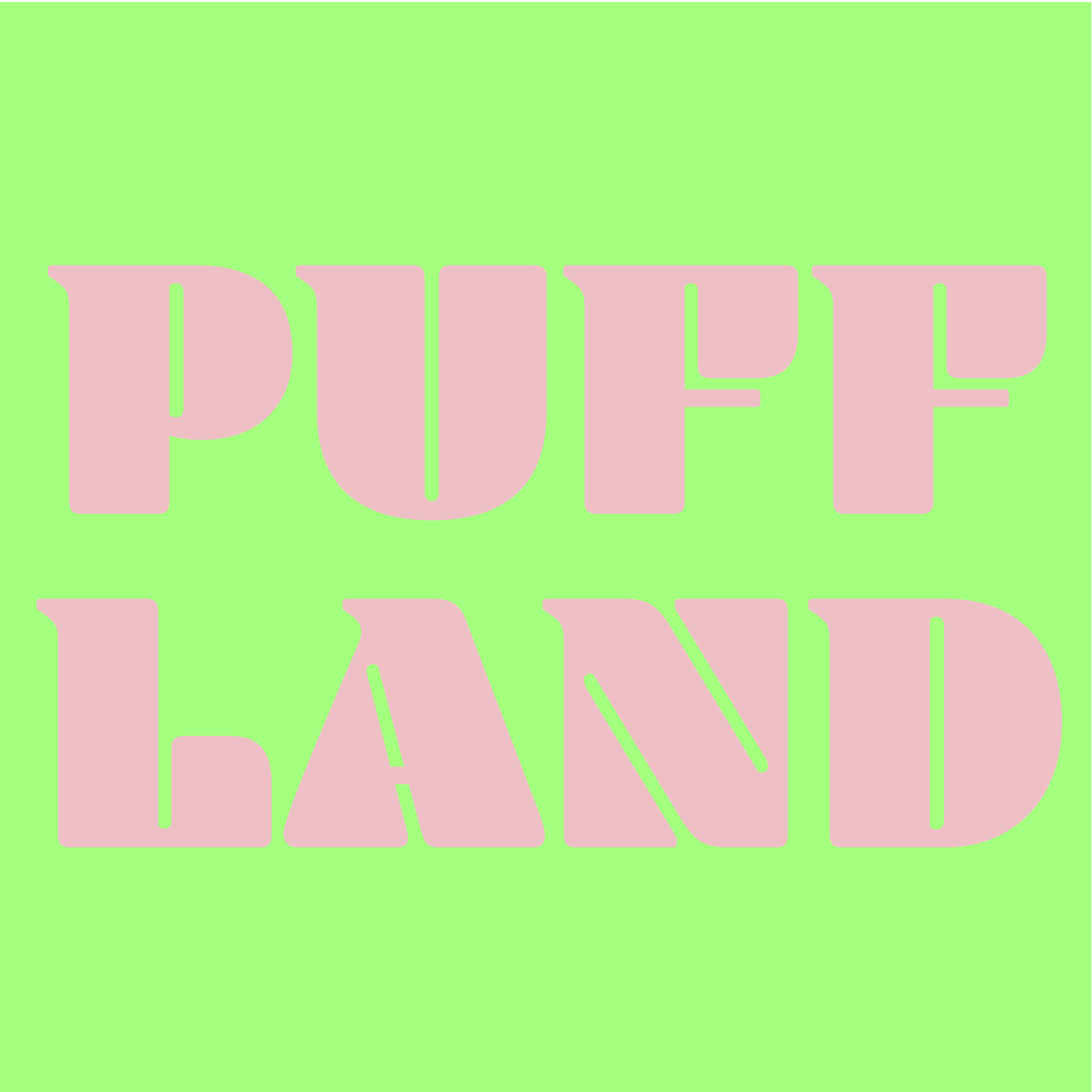
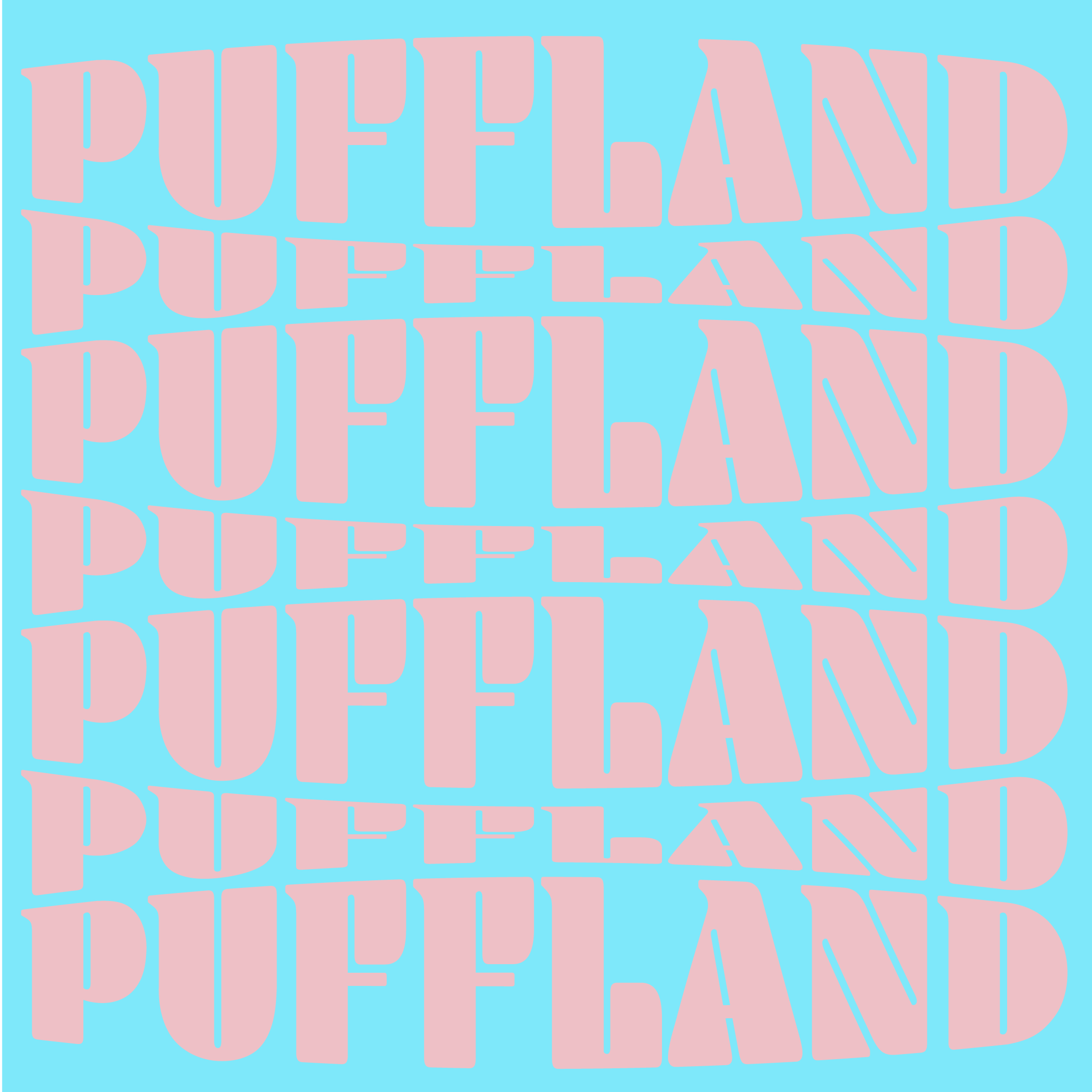
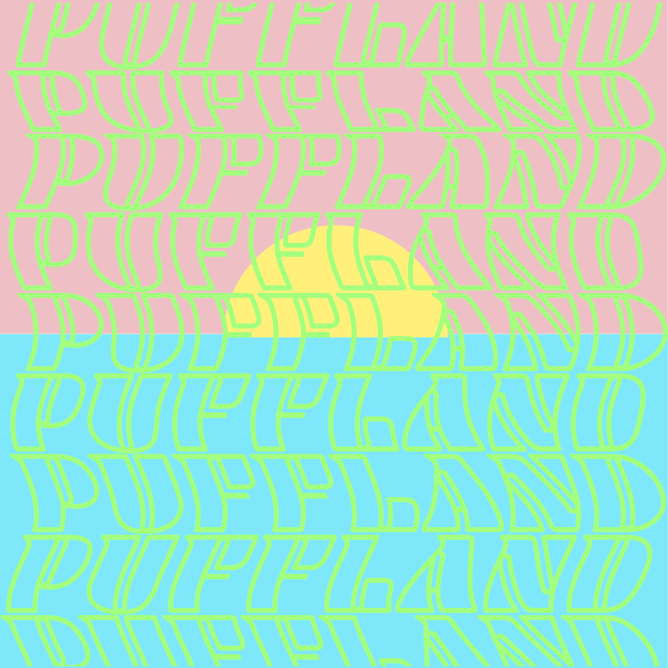
This branding idea was based around this strong yet playful font Blenny. the bright sherbert colours and rounded shapes provided a fun kid in the candy store like vibe which is very much the experience when you see how many products are on the website. The colour combinations work well but sometimes the contrast becomes too much again this is something that would have been refined if more time was provided.
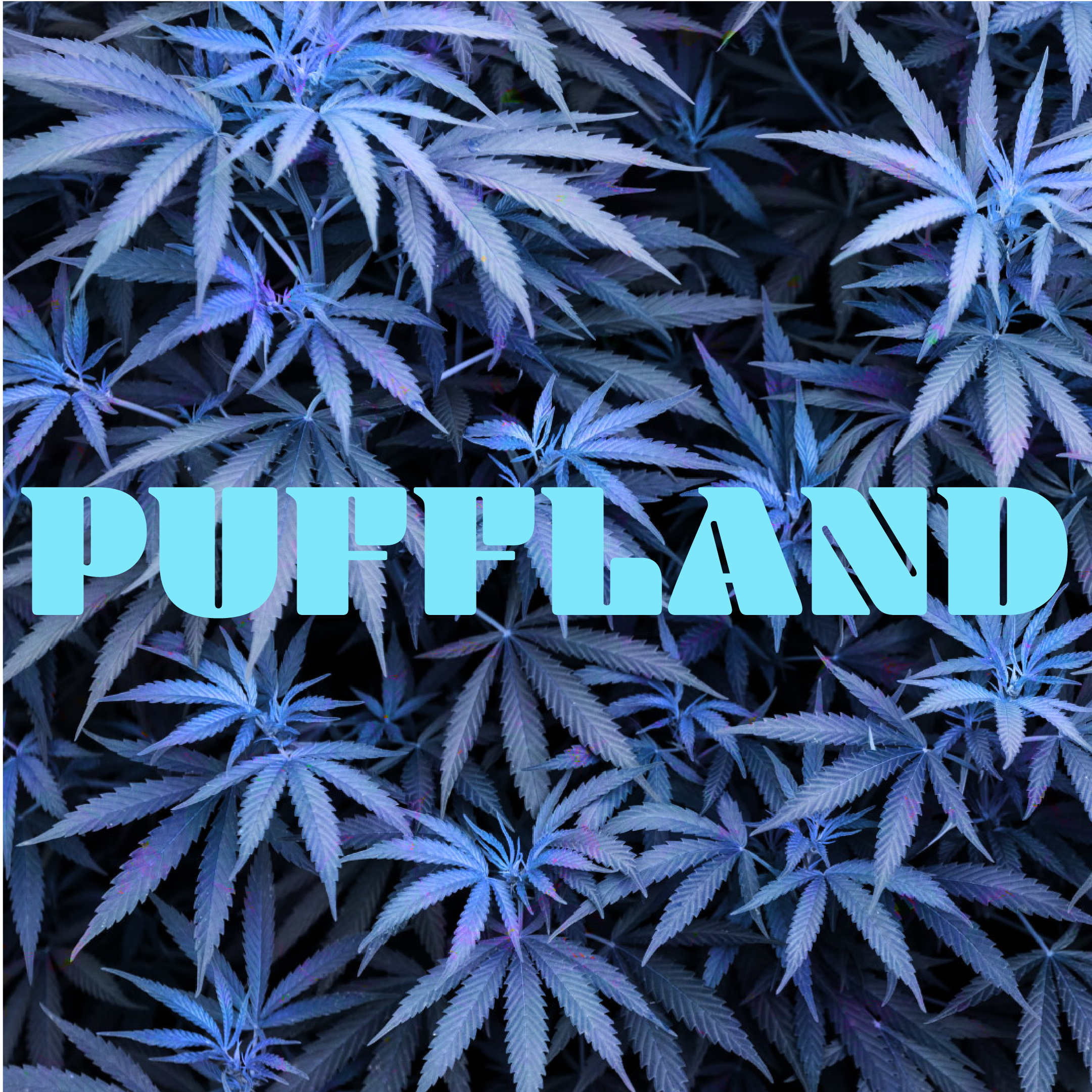

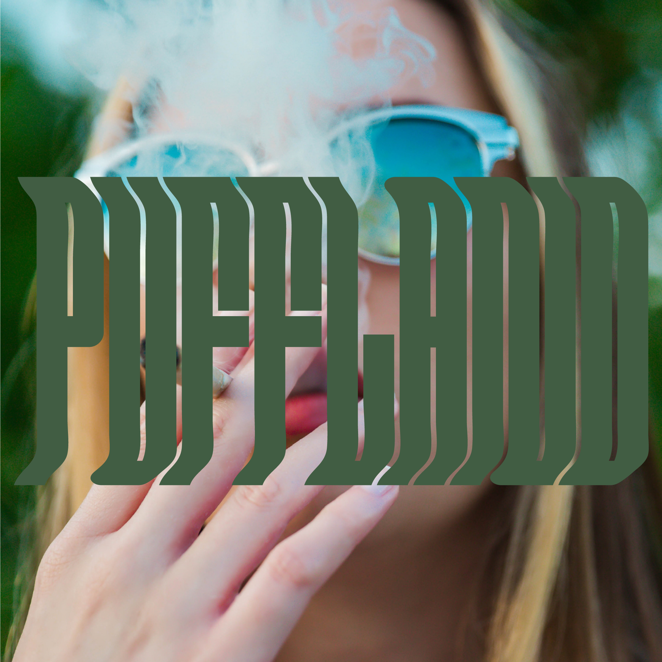
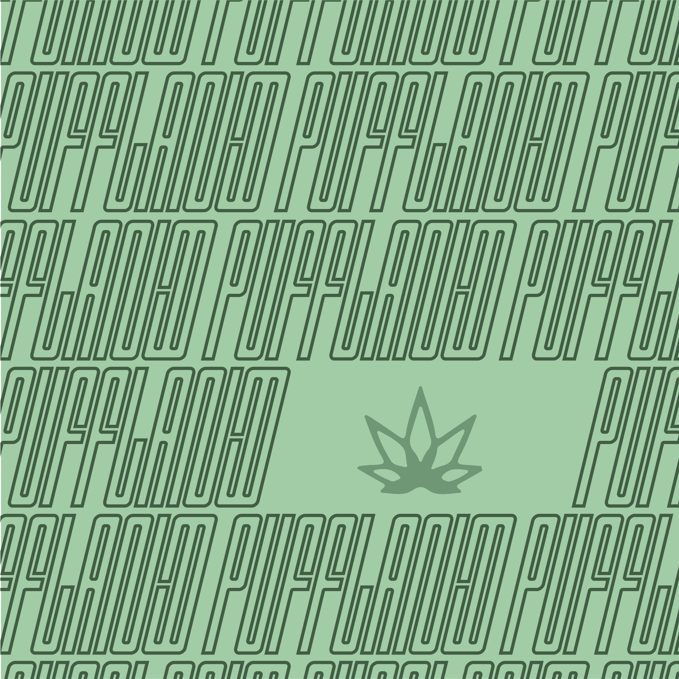
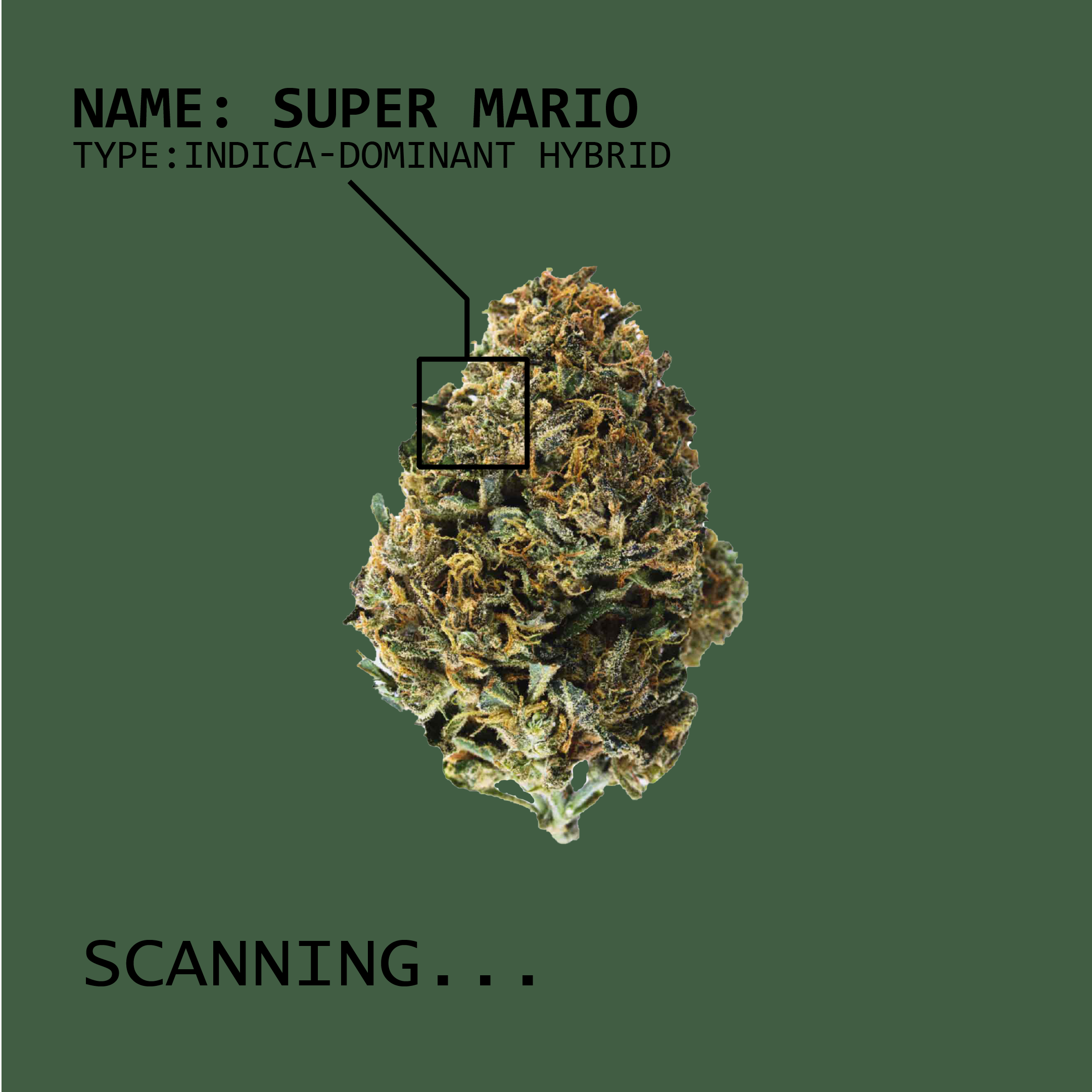
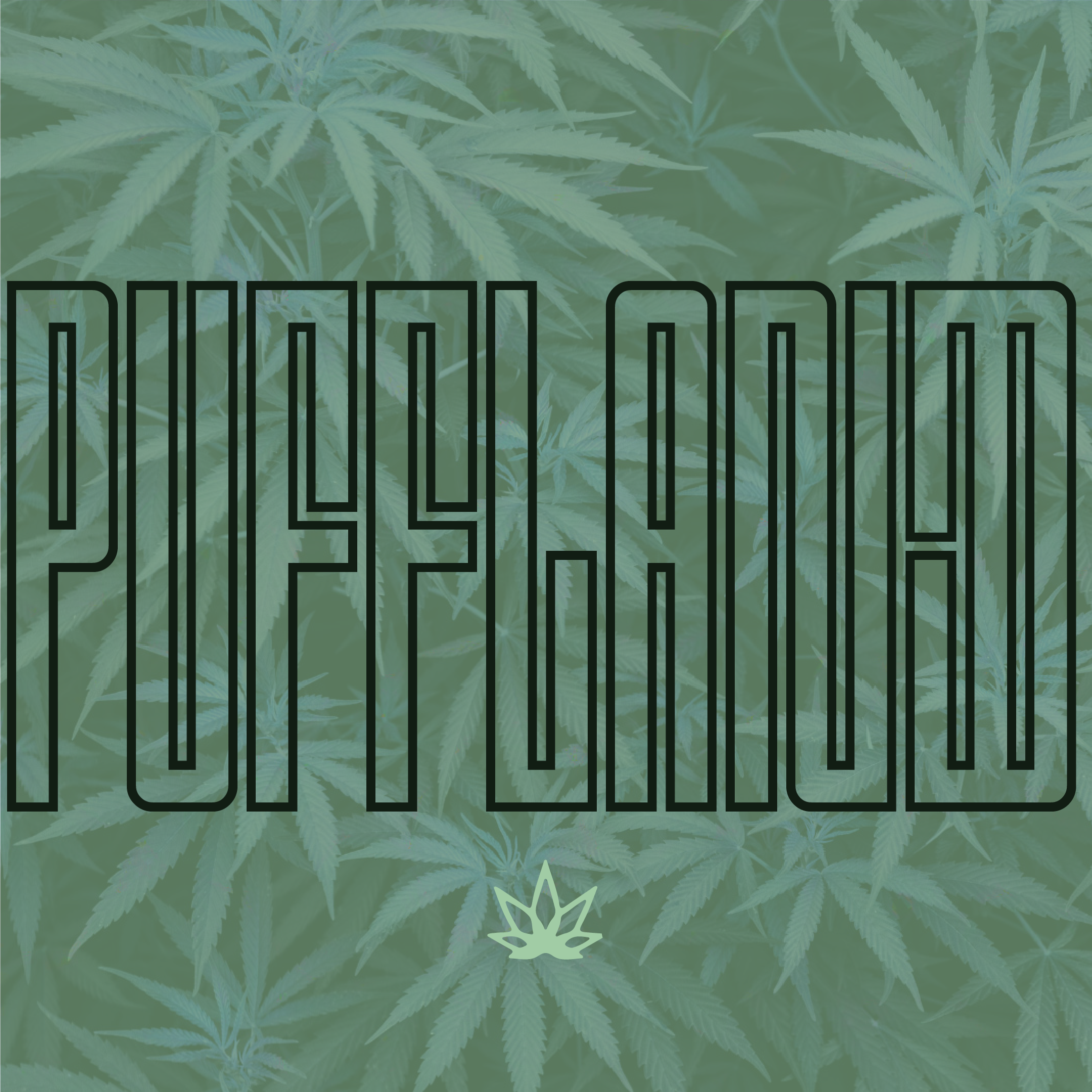
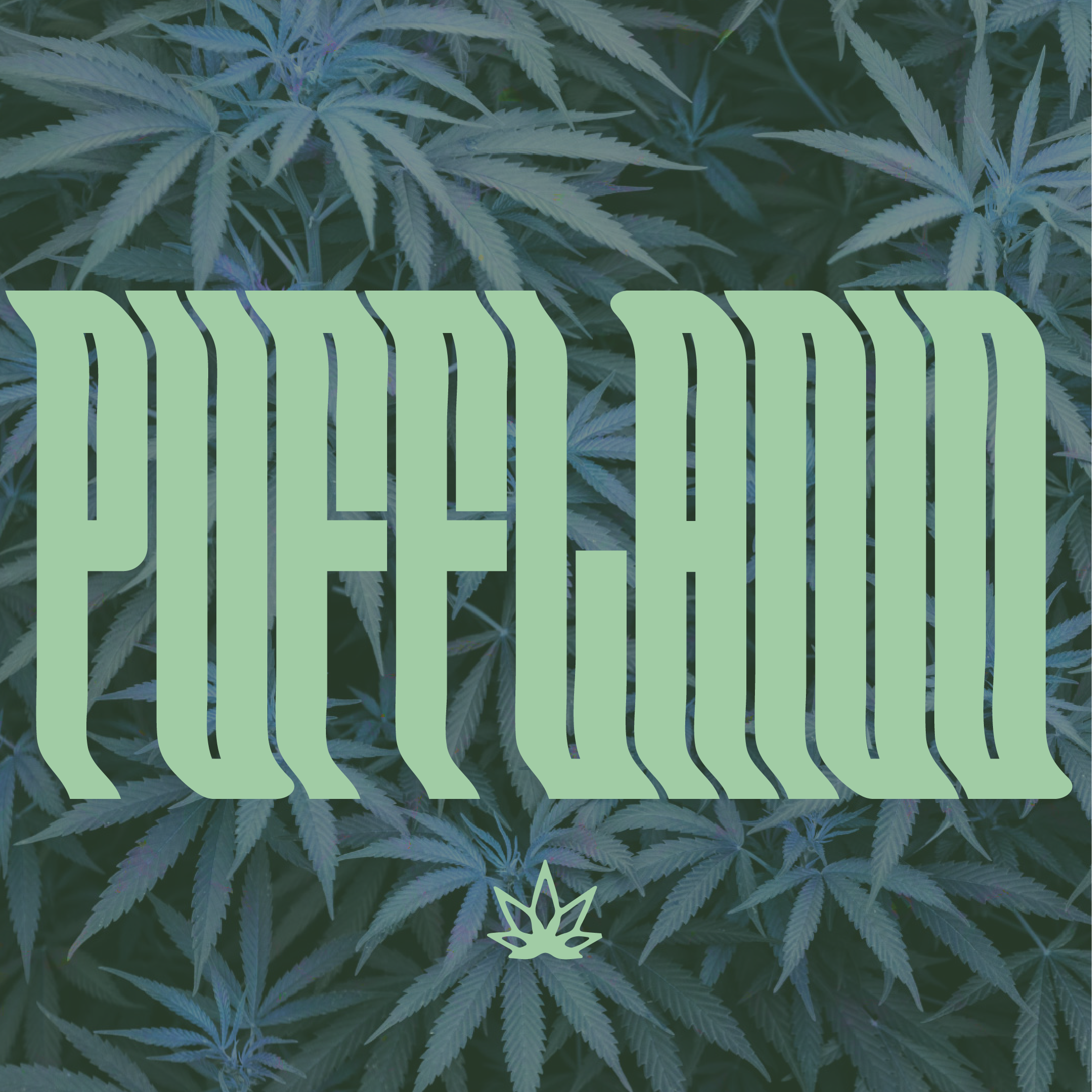
Option #3
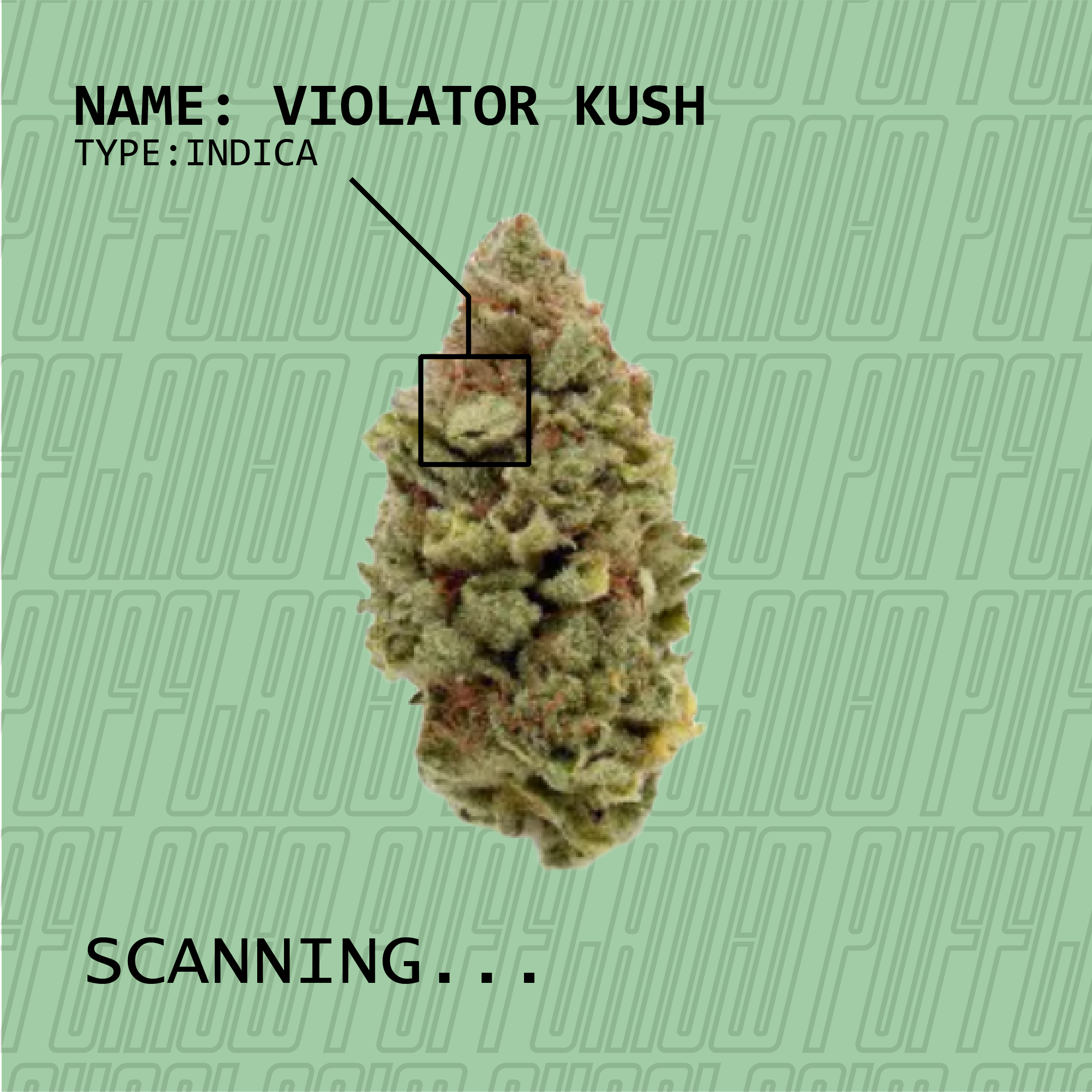
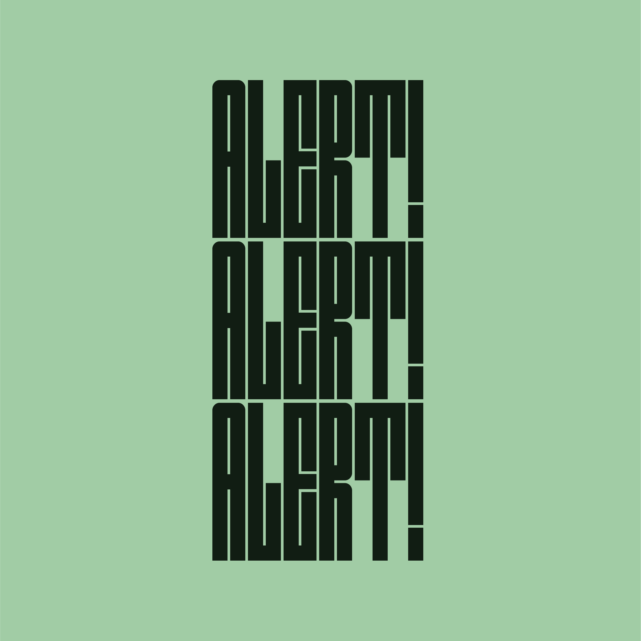
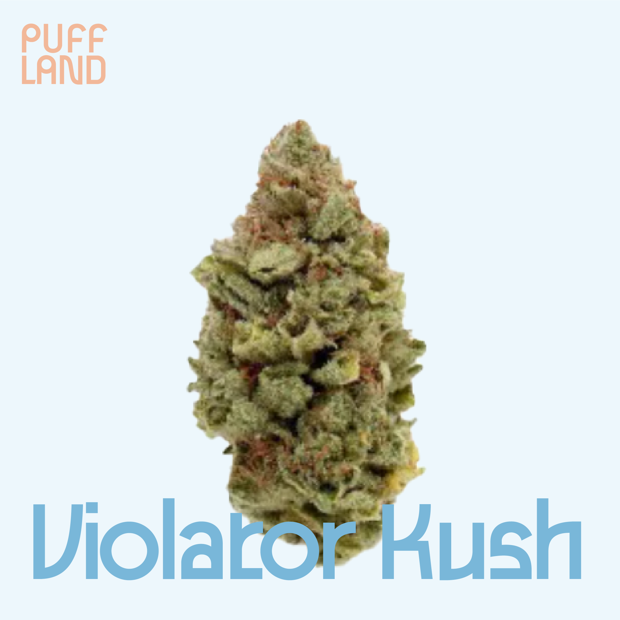
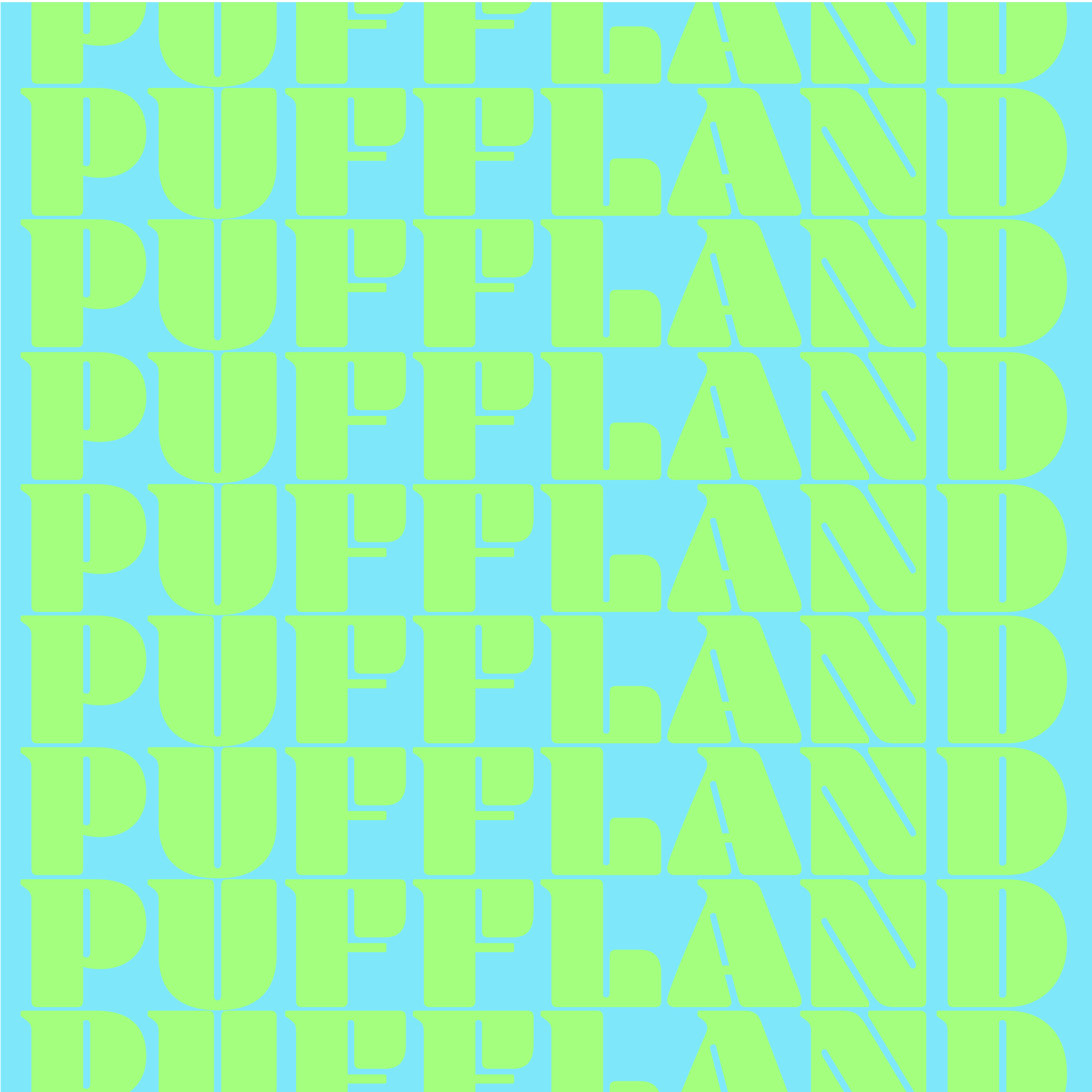
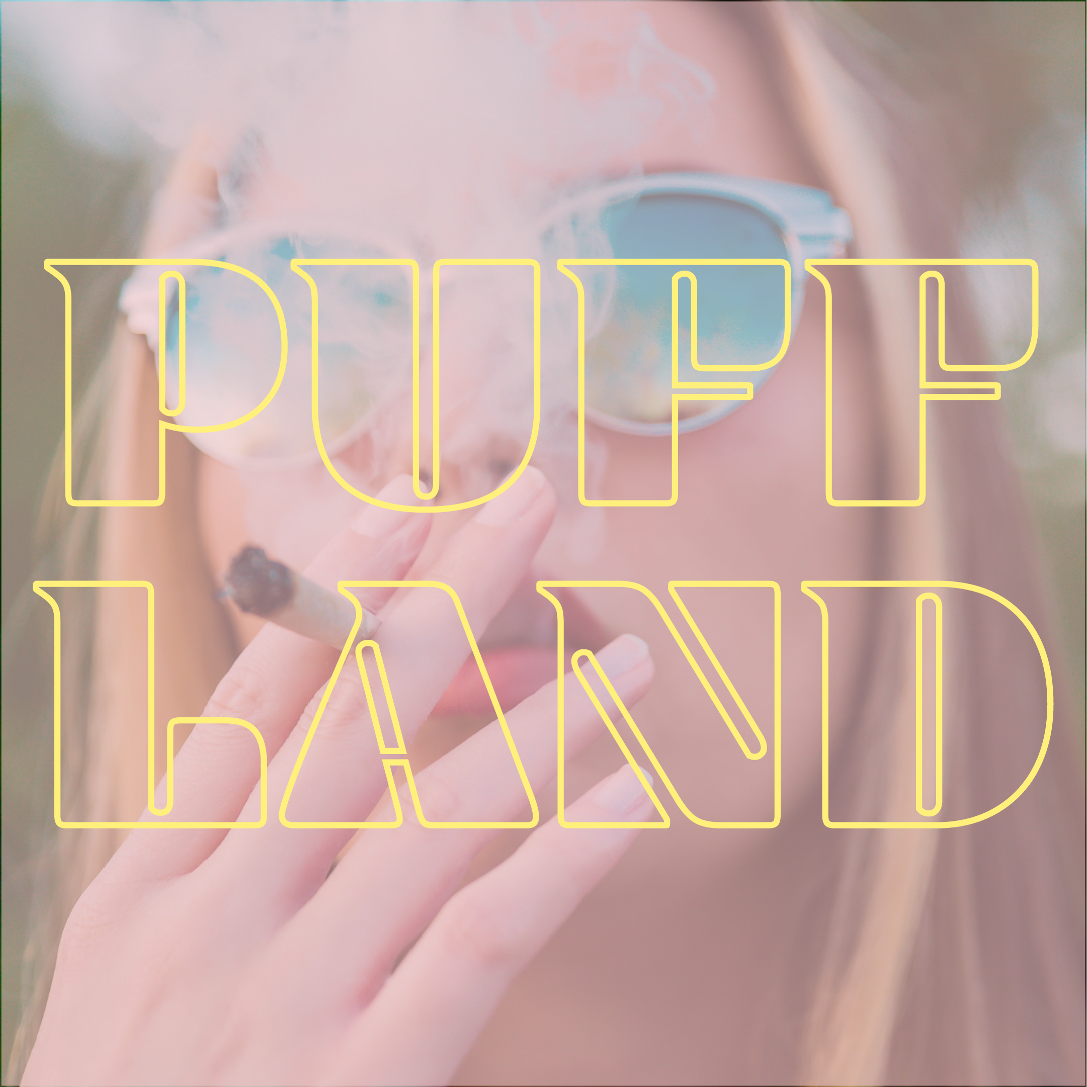
This branding idea was based around this tight font Outward. For this option I focused in on more muted colour palette with pale green, dark green, and black. The graphic elements feature lots of tight repetition much like the font itself. The product feature images also feature sci-fi style graphipcal elements including the “scanning . . .” message. This idea also incorporated the existing logo as a supporting element to the typeface and typographical elements within the designs.